Mission
We all do it: we launch a company, pick a name, design a logo, set up an Instagram account, et voilà, our project “exists.” And honestly, that instinct makes sense. It works, at least for a while.
But things get tricky when you start building out your communication materials. A logo helps people recognize you, but it can’t stand alone. To really work, it needs a graphic system around it: something you can adapt to different formats and media, with the consistency your brand needs.
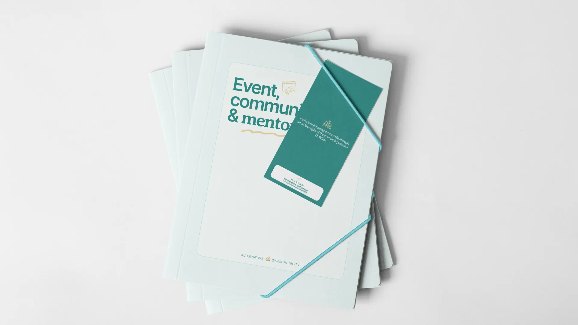
That’s exactly what Alternative & Synchronicity asked us. They already had a logo they loved, but they wanted to turn it into a full visual identity: one they could use for a website, a brochure, and beyond.
Challenges
Design-wise, starting from a blank page is often much easier than reusing existing elements. The latter forces you to take extra constraints into account. This was the challenging aspect of this project: proposing an artistic direction that aligns with and makes sense of what already exists, respecting the original intention, while still bringing creative added value.
Another challenge was to create a consistent brand identity for a company offering services in two sectors that are, at first glance, pretty different.
Solution
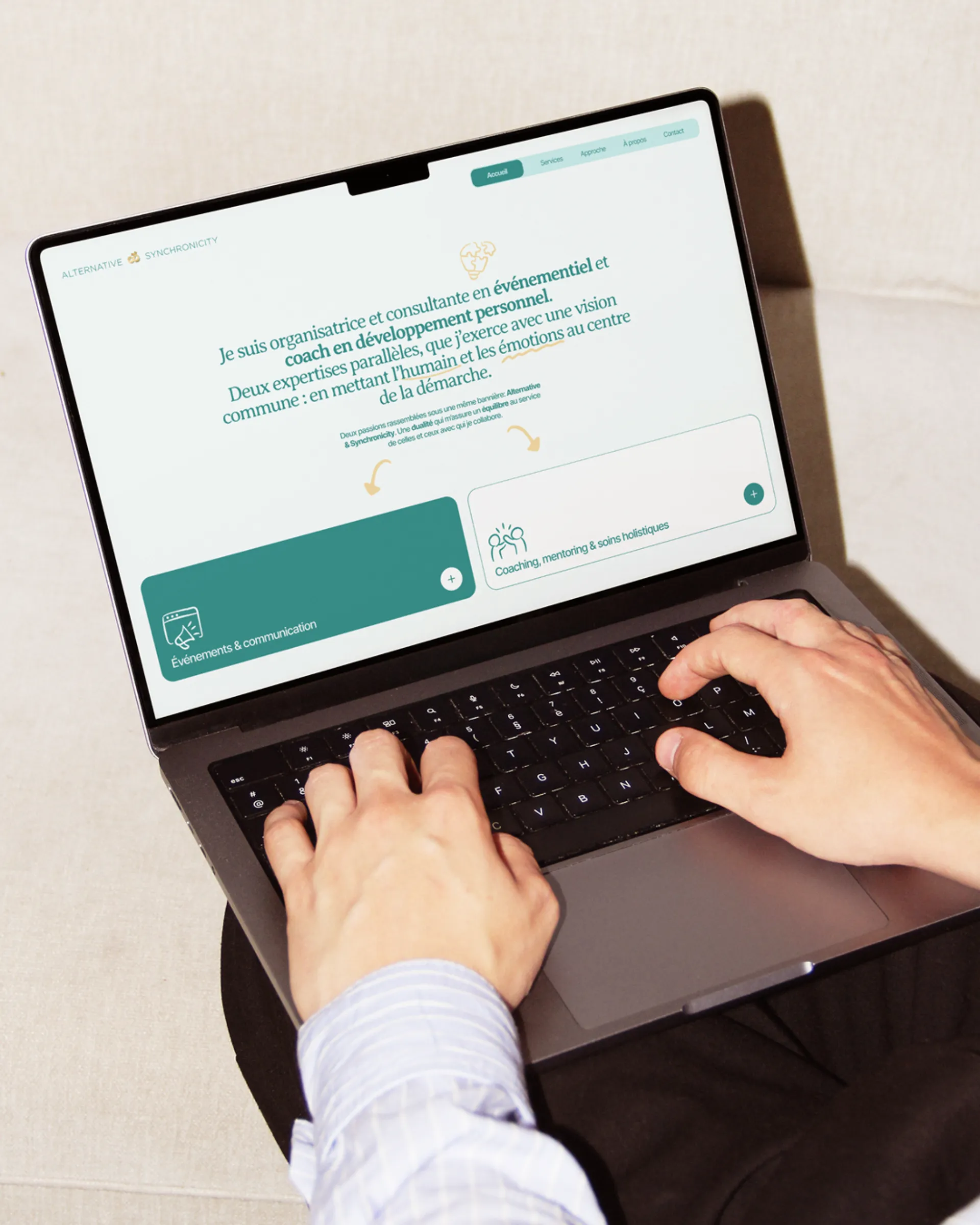
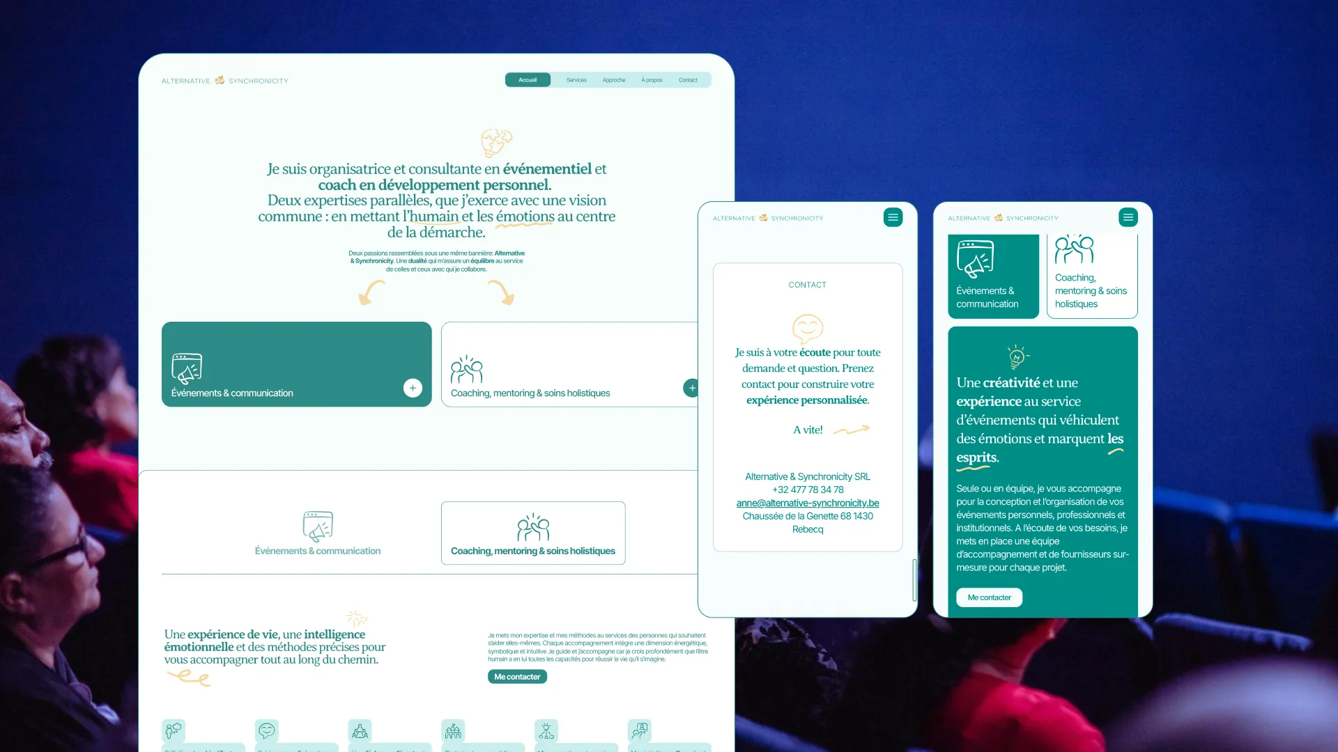
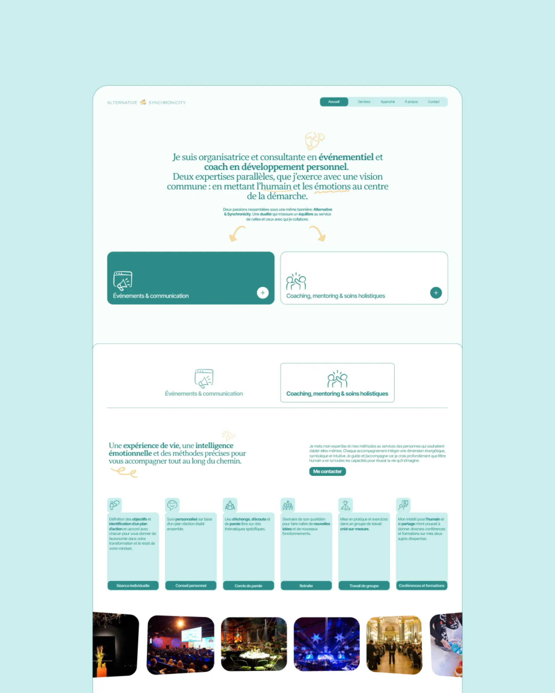
Everything starts with a good story. That’s what Bertrand focused on at the project’s start. He made sure the story was clear, the two services were distinctly labeled, and the methodology served as the common thread tying them together.
Next, we isolated the core elements of the existing logo. The strongest feature turned out to be the color palette, so Aurélien used that as our foundation to develop a cohesive and appealing artistic direction.
Finally, we structured the content and designed it to create a simple yet playful webpage. And after a fit of magic, we ended up with a website built with a headless CMS, delivering a minimalist, fast, and seamless experience.