Mission
Tandem is an established restaurant, coffee bar and bike repair shop in Brussels. The principle is pretty simple: bring your bike in for repair and enjoy a coffee or a bowl while you wait. As well as these two activities, Tandem actively promotes the benefits of urban and sports cycling.
They asked us to update their visual identity and develop a new website.
Challenges
Designing a new visual identity is always challenging because the visual is only the visible part of the iceberg. To work efficiently, the visual universe you propose needs to resonate with all the other elements of the brand identity: mission, values, culture, tone of voice, name and services.
On this respect, the first briefing received from Tandem was pretty vague.
We want something that looks like us.
Cool, but not “too” cool.
Solution
To create a visual identity that matches the spirit and culture of the space, we first needed to understand it well. We needed to know where it’s rooted, where it’s going, what it offers, who is involved and what are values that guide it.
Because to design a brand, you need to understand it.
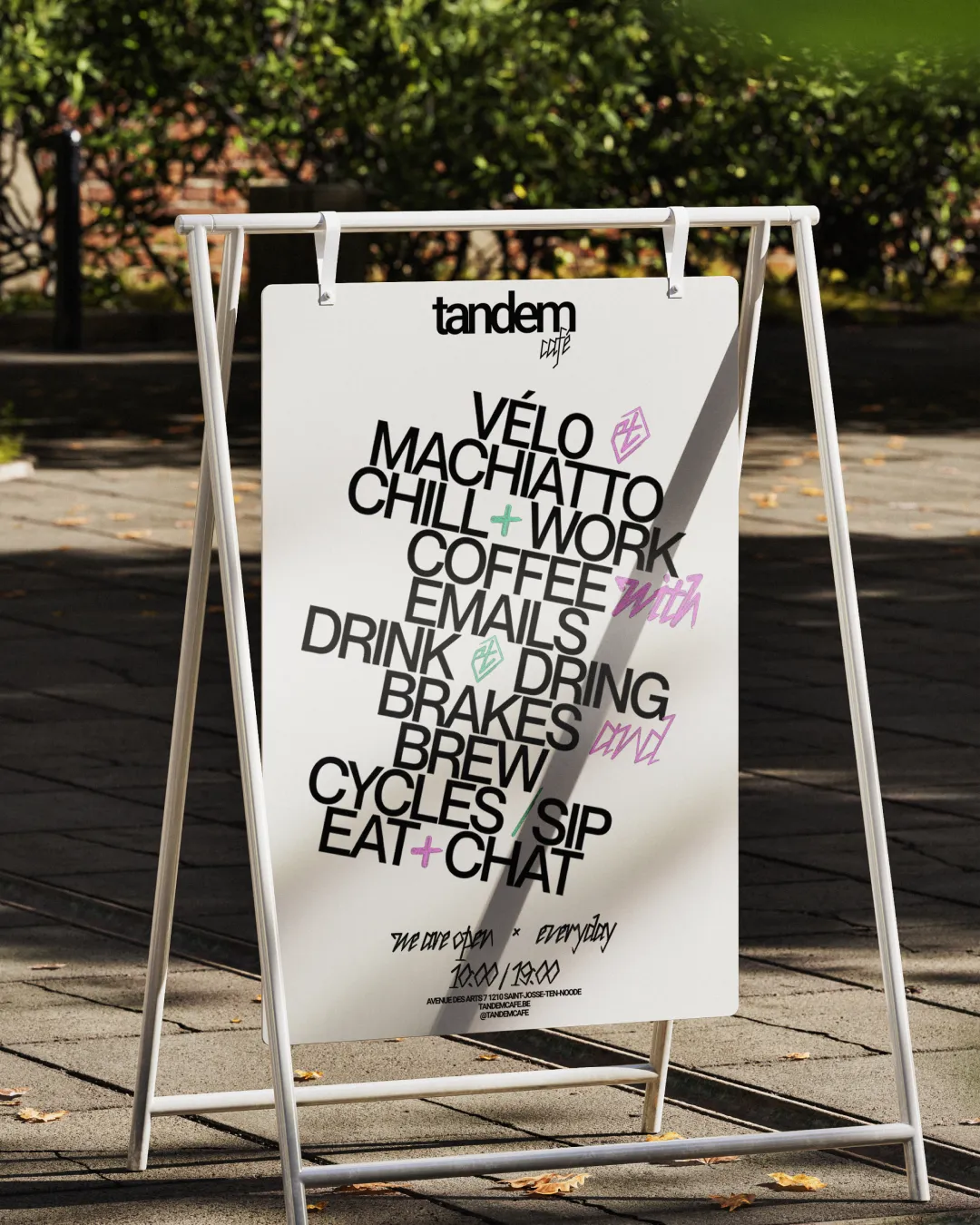
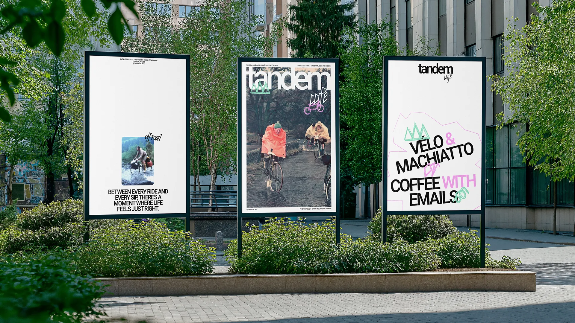
Through workshops and discussions, we concluded that the spirit of adventure is what unites Tandem as a consistent brand despite its multiple activities.
We identified the place as a ‘base camp for your next adventure’.
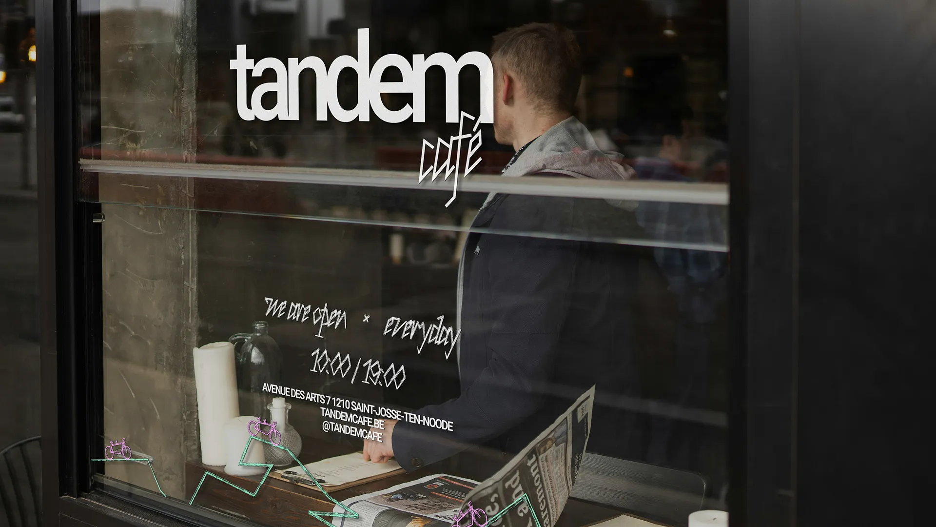
To illustrate this, we used beautiful archive pictures from ‘The Roughstuff Fellowship’. We also created a system to generate pictograms inspired by Hobo signs, a supposedly secret alphabet used by hobos in the US during the Great Depression.